
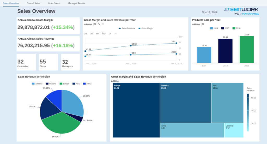
I have been working for more than 10 years developing BI and ETL models and last year I started to expand my knowledge to the visual tools of SAP, mainly SAP Analytics Cloud. Because of that, I was challenged to reproduce in one week one dashboard using these two popular frontend tools: Tableau and PowerBI. The following SAC story was used as reference. The data was provided by SAP for training purposes on the webpage https://saplumira.com/learn/
To accomplish this challenge, I tried on my own, and quickly realized I needed some support. Therefore, I followed the learning material and tutorials provided by Tableau and Microsoft, such as I did to learn SAC through SAP tutorials a few months ago I must state that I was quite satisfy with the quality of their learning material. Tableau and Microsoft. Both companies offer an extensive list of tutorials that goes from the first steps to more advanced features. I’ve just looked some training sessions, focusing only on the subjects that would help me in this dashboard, yet for those who want to go deeper, these sites are very helpful. I will present the main challenges I experienced. It is important to remember that I was using the free version available for download and they have certain limitations.
First Steps:
As I used a flat file, the connection to the source was very simple and intuitive for both tools. When opening the Power BI for the first time I had the impression of already being able to construct several types of graphs just by dragging and dropping the type of graph and the fields that would be made available as soon as I connected to a source, it was like I already knew the tool. Regarding Tableau, my first impression was that tool would be more structured and less intuitive, I would say more formal.
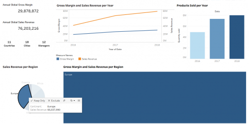
The first impression of SAC was that this tool has an appearance “clean” and intuitive.
First Steps Scores : Power BI : 8/10, Tableau : 6/10 & SAC : 7/10
Ease of Use
As I mentioned earlier, I first tried to build the reports without prior knowledge. In this point Power BI was easier to use, you just drag and drop the component you want to use and that’s it. Very intuitive! There was not necessary any tutorial to guide me to do the most basic functions. On the other hand, I needed a fast introduction to Tableau to do some things that were intuitive in other tools, such as a ranking graph. In fact, after this familiarization with Tableau, the tool was as smooth to use as Power BI or SAC, differently from the first impression I had.
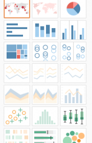
Tableau has an interesting functionality to show you the graphs that are available according the data (Dimensions and/or measures) you have selected. The toolbar Show Me presents all graphs that are available to the data you have selected. As I had to follow the SAC dashboard layout, I didn’t explore much this toolbar, however I had an idea that it will be very useful when working with new visualizations. Once you have an idea what you want to present, Show Me gives you a clue how many dimensions or measures will be necessary to achieve it.
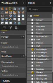
For SAC you need to select the measures or/and the dimensions, the default chart is the bar chart, but the tool also shows you which graphs are available for the measures and/or dimensions you have selected, however SAC allows you to select a gray graph and shows you what date is missing to present the analysis. A relevant subcategory gives you a clue what each chart represents.
Ease of use scores : Power BI : 9/10, Tableau : 8/10 & SAC : 9/10
Data manipulation
Inside the datasheet there was a date field of quarter (2018-Q1, for example) that Tableau and SAC had no problem to identify when I changed the data type, a. In contrast, Power BI did not identify, which was not a problem because I could perform the data manipulations required using the date inside the file. Nevertheless, if I had a similar column to represent the fiscal quarter, I would have to manipulate the data inside the excel itself.
Data manipulation scores: Power BI : 6/10, Tableau : 9/10 & SAC : 9/10
Interactivity
An interesting feature in Power BI is all components automatically interact with each other. And by clicking a bar in a chart, the other elements are filtered, some graphs show the part as a whole. This interaction in SAC and Tableau is manually, but it is easy and intuitive to perform and also the opposite action when you want to keep a component without any interaction.
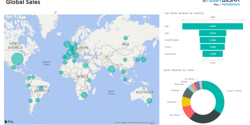
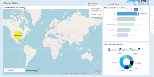
Figure 8 – MS Power BI after selecting USA in Top Sales Revenue by Country graph, the graph Sales Revenue by Lines shows the USA share in the whole.
Interactivity scores: Power BI : 10/10, Tableau : 8/10, SAC : 8/10
Final Dashboard – Overall Results
My conclusion by the end of this experimental week, is that both tools met my expectations, though I would recommend MS Power BI for less experienced professionals and who wants more interactive with a appealing visual. For me, however, Tableau has made me curious and I cannot wait to dig deep in its functionalities. Considering my background experience with SAC, I would recommend this tool for who is looking for a powerful tool with an impressive analytic visualization.
Overall scores: Power BI : 7/10, Tableau : 8/10, SAC : 9/10
Summary – Power BI x Tableau x SAC
I listed some features that I liked most in each tool:
| Power BI | Tableau | SAC |
| Interactivity | Toolbar “Show me” | Web environment (no installation required) |
| Funnel diagram | Data manipulation | Ease of Use |
| Attractive visual | Different filters | Trend graph with forecasts |
Scores Summary
First Steps scores : Power BI : 8, Tableau : 6 & SAC : 7
Ease of use scores : Power BI : 9, Tableau : 8 & SAC : 9
Data manipulation scores: Power BI : 6, Tableau : 9 & SAC : 9
Interactivity scores: Power BI : 10, Tableau : 8, SAC : 8
Overral scores: Power BI : 7, Tableau : 8, SAC : 9